
Friday, 31 March 2017
Peer feedback
During today's lesson we were paired up with someone out of the class and told to assess each others work by writing down the quality of the front cover, contents and double page spread, and suggesting ways of improving it. Here is my feed back from one of my class peers (who happens to be into indie music.)
 My peer suggested to me that I should sort the spacing out on my front cover so that it become more even and less squished together. They also said that there are a few blank spaces on my contents page that I could easily fill, and that I should add a drop capital to my double page spread. I have taken all these factor into consideration and decided to take on this constructing criticism and add these features to my pages.
Thursday, 30 March 2017
Update on double page spread
As I already had the article written for my double page spread, I went over it again and finalised it. As I wasn't fully happy with my rough cut I made some alterations to the double page spread.


On my double page spread, I decided to change the artists name form Abi Sparks to Luna Cooper. I replaced the old name with the new one.

 I also realised that the spacing of my columns wasn't equal at all, so used the rulers in inDesign to ensure that the columns were even and straight. While doing this I also decided to change the colour of the questions I had wrote to orange so they stood out more.


 I decided to remove the random quote at the top of my image on my rough cut, and add more information in the orange boxes at the bottom of the image instead. I decided to do this, as it is more convectional and the quote at the top of the image didn't blend in well and looked out of place.


I wanted to change the photo I used in my rough cut as I got feedback from my teacher and class mates saying the the pose the model was pulling looked too aggressive for the indie genre. I had also realised that the model didn't match the front cover model, which is why I decided to take some photos of my model I used on the front cover, so that I could use another photo of her on my double page spread, however for the time being, I added a different photo until I decided on the appropriate photo to use.


 I also realised that the spacing of my columns wasn't equal at all, so used the rulers in inDesign to ensure that the columns were even and straight. While doing this I also decided to change the colour of the questions I had wrote to orange so they stood out more.
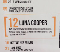
I also added more conventions I had missed out- the page number. Along with the page number, I added the name of the magazine and the date the magazine was issued. I also added a orange line (keeping the running house style) below the bottom of the text so it is separated form the main article text. I ensured that the page number of this article matched the contents page, talking about the interview.


 I decided to remove the random quote at the top of my image on my rough cut, and add more information in the orange boxes at the bottom of the image instead. I decided to do this, as it is more convectional and the quote at the top of the image didn't blend in well and looked out of place.
Here is a overall comparison of my rough cut double page spread and mid -to- final cut of my double page spread.


Wednesday, 29 March 2017
Update on contents page
My contents page has drastically changed in the last few days, with the layout changing, the images changing and some of the content changing..


 I also added a variety of images, from photos of artists, to photos of gigs to photos of festivals I have been to. I decided to add a variety of images as it is more appealing to a indie genre as there are lots of indie festivals that my TA like going to and they are interested in gigs.


I decided that I wanted to change my whole contents page due to feedback and further research I have done, looking at a mood board of contents pages from Q, NME and some kerrange copy's. I feel like the new design I have went for suits the Indie genre as it doesn't have as much of a clean basic finished, but is busier and has lots more content on it..
Firstly... as this was a major change I had to sketch a design of what it will look like, (see blog post from 21st March.)
This sketch helped me when creating it on inDesign.
To start things off, I decided to change the title at the top of the contents page from 'Inside this week' (Left image) to 'Contents' (Right image.) I did this as the magazine style I was getting inspired from did this. I also changed the position and size of the title, making it sit on the left side of the page instead of the centre and made it much smaller so that I was able to add more content to the page.


 I also added a variety of images, from photos of artists, to photos of gigs to photos of festivals I have been to. I decided to add a variety of images as it is more appealing to a indie genre as there are lots of indie festivals that my TA like going to and they are interested in gigs.
I have also added at the bottom a page number, the date and the magazine name as other indie genre magazine did this and I think it adds a professional quality to it. I also added oriental features at the bottom, these features being photos of the Instagram logo, twitter logo and you tube logo with the username for these links. I used Photoshop to join up these 3 images together and turned the brightness and contrast up on them so I could say that I had edited them enough to call it my own image. I also added a line at the bottom to cut the text off from the page number.


I made the main article of the magazine (Which was my double page spread) stand out against the rest of the articles by adding blocky brackets around the article, and making the article font size 3x bigger than all the other articles. This really made the article stand out and added a professional touch to my magazine.

I have also added a 'features' box on the right hand size of my contents page, as I found that when I was looking at a mood board of contents pages, that most contents pages have a feature/plus box at the bottom counting the most important articles in t the magazine. Because of this reason, I have decided to add a features box, as this incorporated my rough cut contents page as the only articles I had on the page was 'features.

I have added a subscription box at the bottom of my contents page, as this was used in previous contents pages I have analysed.

Finally, I have added a twitter box at the bottom, telling my TA that if they use the trending hashtag 'Vibe' they can access exclusive information. By the audience using a hash tag, it will advertise my magazine using social media as well.

Overall, here is a comparison between my rough cut and my mid-final cut. I ensured that the articles matched my front cover, as on the rough cut, they didn't always match.


Tuesday, 28 March 2017
Update on front cover
Through out the past few days, I have been focusing on my front cover and listening to feed back I have been given and researched a bit more into front covers, as well as looking at my previous research into front covers.
From my rough cut, I have made a few changes to what is on my front cover and the way it is presented...


The first thing I realised was that my images needs to be changed. My rough cut image was a mid shot of my model wearing sunglasses (Left), but when I looked back at my research I realised that there was a very small minority of magazines that used models wearing sunglasses. Because of this, I decided to retake my photos a few days ago and have settled on a photo I think will work image on (image on the right)
As well as changing the photo, I have decided to change the models name I have used and change it to the name 'Luna Cooper.' I also changed the sub text below the artists name as it now address the audience directly instead of just making a statement.
(Rough cut) (New final cut)


I have also reduced the size of the mast head as I realised that when I printed it off, it was far too big. I also added a 3D effect of the mast head. I did this by typing out the masthead name in white, then arranged it to sit behind the black masthead written in black. I also changed the line going through the title to white, as it balanced the image.
(Rough cut) (New Final cut)


I have also added more text, including a 'plus' section which includes different artist's names.

As well as changing conventions on my front cover that I already had, but wanted to improve (such as my photo) I have also added conventions I forgot to add in, I now have a completed bar code, with a price inside, the date the magazine is issued, a website address and a twitter username.

I got rid of the lines with the date and issue number inside as I didn't think this looked right. Overall, here is a comparison of my rough cut front cover vs my half way stage of my final cut.


Monday, 27 March 2017
Page number research
Today, I started to add page numbers to my double page spread. I wanted it to look as professional as possible, so did some further research into what magazine such as NME ad Q use at the bottom of their pages next to their page numbers on their double page spread.
My findings show that on a double page spread, only the right hand page has a number on it and the left page (with the photo on) doesn't. My finding also show that magazines (such as the NME ones below) use a line at the bottom of their page to separate the text and page number. The page also has the name of the magazine and the date at the bottom next to the page number, therefor I am going to use these techniques on my final cut.


My findings show that on a double page spread, only the right hand page has a number on it and the left page (with the photo on) doesn't. My finding also show that magazines (such as the NME ones below) use a line at the bottom of their page to separate the text and page number. The page also has the name of the magazine and the date at the bottom next to the page number, therefor I am going to use these techniques on my final cut.


Sunday, 26 March 2017
Article for double page spread
In today's lesson, I looked back at my audience research and decided to write up my double page spread article. My TA said that on a double page spread they would be most interested in reading a interview, so that's why I decided to write up one.
Firstly, I typed it up on notes so that all the spelling & grammar mistakes would be highlighted. I then placed the text on my inDesign double page spread and put it into columns. Here is a copy of my article.


Saturday, 25 March 2017
Gig photo
I went to a gig and thought it would be a good idea to add some photos to my contents page, as when I analysed my rough cut I realised the only photos on my contents page were photos of people, therefor I thought it would add a variety of images if I got photos of the crowd/ artist.


These were the two best photos that I had taken, but I have decided I am going to use the second photo, as I think that the silhouette of the crowd member in front of the band make the photo really effective and gives it a lively atmosphere.
Friday, 24 March 2017
Making barcodes
In today's lesson, we were taught how to make bar codes for the front cover using Adobe Photoshop. I then later added the numbers to my bar code in inDesign.


Thursday, 23 March 2017
Barcode research
After I created my own barcode on Photoshop, I wasn't sure on what to add to the barcode to make it look like a real one. So I decided to do some further research into what is put onto barcodes.


Q barcode
 This barcode, from the music magazine "Q" is position in a vertical potions on the page instead of a horizontal position, therefor the extra information on the barcode is position differently compared to barcodes that sit vertically on the front cover. This barcode contains the same information as NME, as it shows the month the magazine was issued, along with the year, it also has the music magazines website and has 13 random numbers along the bottom of the barcode.
Conclusion
From this research, I have concluded that my barcode will include 13 random digits the bottom of the lies, will have the month and year the magazine was issued and will contain a website address & price.
By having a website on the barcode, in enables readers to look further into articles and allows them to see online copy's of the magazine.
Here are some screen shots of barcodes from music magazines
Mojo's barcode
This barcode has the month the magazine was issued, the year, the price of the magazine (In sterling and dollars) and underneath the striped lines, there are 13 random digits underneath.
NME barcode

On this barcode from NME, the price has been added above the barcode (including 3 other prices from different country's), the date, month and year of issue, the website for the magazine and then the barcode, in which also has 13 digits under the barcode.
Q barcode

Conclusion
From this research, I have concluded that my barcode will include 13 random digits the bottom of the lies, will have the month and year the magazine was issued and will contain a website address & price.
By having a website on the barcode, in enables readers to look further into articles and allows them to see online copy's of the magazine.
Wednesday, 22 March 2017
Possible quotes for double page spred
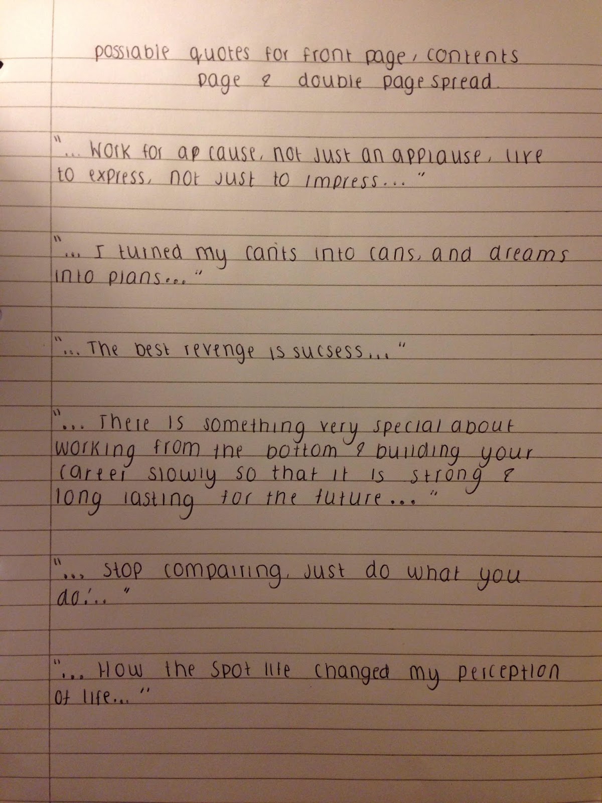
Today, I thought about what quote I could put on my double page spread. Here is a list of possible quotes. I am going to use a quote on the middle of my text on my double page spread, and also add one into one of the answers on my double page spread.

From this list, I have decided that I am going to keep the same quote in the middle of my double page spread as my rough cut and add the quote ' the best revenge is success' to my final cut.
From this list, I have decided that I am going to keep the same quote in the middle of my double page spread as my rough cut and add the quote ' the best revenge is success' to my final cut.
Tuesday, 21 March 2017
Total new contents page design..
Today I was looking back at my initial contents research and was comparing contents pages that I analysed.
As I wasn't too keen on the design I used in mu rough cut (I was inspired by Mojo) I have today decided to discard my original design and start again using a different layout.
I prefers the busier content pages as more of the indie magazine I researched used this style, and I personally think that it looks more professional full of text and images. I decided to not use my rough cut design as it was looking very bare, I wasn't happy with the photos and the layout I used.
After a couple hours spent researching a bit more into contents pages (magazines such as NME and Q), I have decided what I would like my contents to look like.
Below, I have done a (very..) rough sketch of a contents page. I have added where I would like photos, the exact text I would like to see in it, the layout if the page and conventions such as lines separating text out, the name of the magazine and date at the bottom and the page numbers.
I have also decided to add social media usernames and a website address, as the internet plays a major part in today's society, so with these links, it allows my audience to be the first to know about when exclusive issues are coming out, what will be in the issues and most important, who is going to be inside the issues.
To ensure that this style of magazine still suits my TA, I asked 5 members of my TA which style they think looked better and they said that my new style is better as it is busier and has more content on, which is appealing as there are lots more artists names on there.

Monday, 20 March 2017
Name change of double page spread artist
I decided that the name 'Abi Sparks' sounded to 'pop-ie' and wasn't indie enough. Because of this reason, I researched first and surnames I could use. I wanted a name which was shot but effective and came up with the name Luna Cooper. I feel like this name has a more indie edge to it and didn't sound like a pop girl's singers name.
Sunday, 19 March 2017
Photoshoot attempt No.2 (Front cover and double page spread)
Today was my second attempt at taking my photos...
I decided to use the same model for both my front cover and double page spread and use 4 photos for my contents page as this was the average amount found on one. I used my photo planning sheet and this was the outcome of photos..
I am going to a gig, so have decided to take some photos while I am there so I can add them into my contents page so that it has a variety of image's in. Once I have some photos from the gig uploaded, I will choose between some pf the possible double page spread photos to add to my contents highlighting the interview it the artist.
Possible front cover photos:


This was the photo I decided to use as it is a mid shot photo, has the correct lighting and facial expression that fits my magazine style/genre well.
Possible double page spread photo's:
I decided not to use this photo as it was too close up and this is not conventional in a music magazine


I decided not to use this photo as I feel it looks too much like a photo out of a pop magazine, as the model looks very happy and fun, which isn't the style I am going for- I am going for a look where the model is confident and has attitude.

This was the photo I decided to use as it shows the model attitude and is a more edgy photo, rather than a plain mid shot of the model smiling/pulling a serious facial expression. I also asked my class peer what they thought about the photo's I had taken for my double page spread and they agreed that this was the best photo to use as it shows a confident attitude.
Subscribe to:
Comments (Atom)