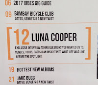
I decided that I wanted to change my whole contents page due to feedback and further research I have done, looking at a mood board of contents pages from Q, NME and some kerrange copy's. I feel like the new design I have went for suits the Indie genre as it doesn't have as much of a clean basic finished, but is busier and has lots more content on it..
Firstly... as this was a major change I had to sketch a design of what it will look like, (see blog post from 21st March.)
This sketch helped me when creating it on inDesign.
To start things off, I decided to change the title at the top of the contents page from 'Inside this week' (Left image) to 'Contents' (Right image.) I did this as the magazine style I was getting inspired from did this. I also changed the position and size of the title, making it sit on the left side of the page instead of the centre and made it much smaller so that I was able to add more content to the page.

I have also added at the bottom a page number, the date and the magazine name as other indie genre magazine did this and I think it adds a professional quality to it. I also added oriental features at the bottom, these features being photos of the Instagram logo, twitter logo and you tube logo with the username for these links. I used Photoshop to join up these 3 images together and turned the brightness and contrast up on them so I could say that I had edited them enough to call it my own image. I also added a line at the bottom to cut the text off from the page number.

I made the main article of the magazine (Which was my double page spread) stand out against the rest of the articles by adding blocky brackets around the article, and making the article font size 3x bigger than all the other articles. This really made the article stand out and added a professional touch to my magazine.
I have also added a 'features' box on the right hand size of my contents page, as I found that when I was looking at a mood board of contents pages, that most contents pages have a feature/plus box at the bottom counting the most important articles in t the magazine. Because of this reason, I have decided to add a features box, as this incorporated my rough cut contents page as the only articles I had on the page was 'features.
I have added a subscription box at the bottom of my contents page, as this was used in previous contents pages I have analysed.
Finally, I have added a twitter box at the bottom, telling my TA that if they use the trending hashtag 'Vibe' they can access exclusive information. By the audience using a hash tag, it will advertise my magazine using social media as well.
Overall, here is a comparison between my rough cut and my mid-final cut. I ensured that the articles matched my front cover, as on the rough cut, they didn't always match.


No comments:
Post a Comment