Tuesday 28 February 2017

Front cover paper draft

In today's lesson, I created a paper mock of what I think my front cover will look like. 
I sketched (not very well..) what I think the front cover will look like and added text to where I think is appropriate. I added conventions such as a masthead, a bar-code, image and price.

I also added a list of what image I am going to take, inducing what the model is going to wear, the facial expression the model is pulling and the background/setting I am going to take it in.

I also added a check list of what my front cover must include to be successful.


Monday 27 February 2017

Font research

In lesson time, we discussed the different style of fonts there is, how music magazine layout their information and image and discussed the key conventions of the popular music magazine NME.

Displaying IMG_6773.JPGI also researched into different style's of magazines. Predominantly there are 2 styles, 1 being the 'blocky' look and the 2nd being 'heavy image based.' After looking at other Indie style magazines, I have chosen to use the heavily image based style as most other Indie magazines use this look and it fits the genre well.

I have also decided to use 'San-Serif' font as it gives a more informal friendly look, which is what I'm looking for. I looked though numerous magazines and looked at their style and layout as this helped me finalise on the layout and font style I am going to go for.

When analysing NME, I noted all the key conventions on how they make their magazine unique and their layout on the pages. I closely looked into the detail on who they portray an 'indie' image and I then took into account how I can use this information on my magazine.

Sunday 26 February 2017

Overall results from my questionnaire

Here are the overall findings from my questionnaire...

NAME: VIBE

COLOUR SCHEME: ORANGE, BLACK AND WHITE

DOUBLE PAGE SPREAD ARTICLE: QUESTION AND ANSWER INTERVIEW- SOLO ARTIST

FRONT COVER IMAGE AMOUNT: ONE DOMINANT

PUBLISHED: MONTHLY

PRICE: £2.99


Saturday 25 February 2017

Results from questionairee

I asked a group of people to fill out my survey and these were the results...


Question 1.
I asked my TA their thoughts on what I should call my magazine. I gave my TA the option of 6 names, with the most popular name being 'Vibe' with 55% of my TA saying they liked this name best. The second most popular name was 'unplugged' with 19% of my TA saying they liked this name best. 
Due to the large difference between the 2 most popular names, I am going to go with my finding, and therefor call my magazine 'Vibe.' I like the name Vibe as it simple, like other magazine in this genre (NME, Mojo) and therefor suits in well with the existing market within the Indie genre.


Question 2.
In this question, there was a tie between having red or orange as my the additional colour. I have chosen to use orange as my additional colour as NME's additional colour is red and I don't want my magazine to be masked by this existing popular magazine. Not only is orange is a bright eye catching colour, but is also a gender-neutral colour, in which works for my TA as I have mixed gender. 


Question 3.
I asked my TA what they would prefer to see on a double page spread, and 73% said they would like to see an interview of an artist. Therefor, I am going to write up an interview and write it up in a question and answer style. 


Question 4.
100% of people that answered my questionnaire said they would prefer to see one dominate image on the front cover. I am going to go with the audience and only have 1 image on the front cover. This makes a simplistic look and doesn't look messy. The simplicity of 1 dominant image suits the genre I am basing my magazine on, as other magazines I have analysed only have 1 image on the front cover.


Question 5.
My TA had indicated that they would prefer to see a soloist on my double page spread. This therefor gives me the idea that my double page spread will consist of a question and answer interview with a solo artist. 


Question 6.
I asked my TA how often they buy music magazines so that I can follow the convention of having the date and the year on the front cover. My TA have indicated that the majority of them buy magazines monthly. Therefor, I am going to issue my magazine monthly. Although some people said they don't buy music magazines, they still read them online, which is why it is important to include the website on the magazine somewhere.  


Question 7.
For my final question, I asked my TA how much they would pay for a music magazine, so that I can combined this with the other front cover research I have conducted, to get a price for my magazine. My TA have said they they are happy to pay £2.99, therefor I am going to price my music magazine at £2.99 as this is also the average price of existing music magazine. 

Friday 24 February 2017

Questionnaire questions

Here is a list of questions I am going to ask my TA...

1. What name do you like best for a music magazine?
-Beat
-Vibe
-Unplugged
-Clang
-Studio
-Base

2. Along with black and white which additional colour would you most like to see?
-Purple
-Red
-Blue
-Orange

3.What would you like to see on a double page spread?
-Interviews
-Reviews
-Artist information

4.How many images would you like to see on a front cover?
-One
-Multiple

5.Would you prefer the double page spread being on a band or soloist?
-Band
-soloist

6. How often do you buy music magazines?
-Weekly
-Monthly
-Never

7. How much would you pay for a music magazine?
-£1.99
-£2.99
-£3.99

Thursday 23 February 2017

Magazine name idea's

During today's lesson, I stared to think about the name of my magazine. I did some research into all the different indie magazines there is and created a spider diagram of their names. I also created a spider diagram of possible names I will use. 

I will then ask my TA which name they prefer and will use the name which has the highest percentage of votes.

Here is a spider diagram of existing indie magazine names 
My findings show that most indie music magazines have a short simplistic mastheads, consisting of between 1 and 5 letters, with some exclusions. A lot of the mastheads are noises e.g. Clash, Kerrange, and are usually made up of 1 word.


Here is a spider diagram of name ideas for my music magazine

I decided to use these 6 options for name ideas as they are short and simplistic, excluding the name unplugged, and all relate to music in some way e.g. Vibe- people get good 'vibe' when listening to music they like. Beat- music has a beat to it.


Wednesday 22 February 2017

Audience research- Questionnaire

Now that I have done my research of analysing 5 front covers, 5 contents pages and 5 double page spread's, it is now time to get my TA involved... 

My TA is a mixed gender audience, teens- late twenties, white British, and obviously into the Indie Genre. 

In our audience research lesson we had a couple weeks ago, we discussed what ways we could get audiences opinions. One of the most popular ways of getting the TA involved was to conduce a questionnaire.

I used the online server called 'survey monkey' which is a website, in which you can create online surveys that I could send out to people for them to fill in and me to then later analyse the results. 

I am going to compile a list of questions that I am going to ask my TA. This research will help me with the creation of my magazine, as I will get direct TA opinions. 

Tuesday 21 February 2017

Double page spread analysis 5

The final double page spread I am going to analyse is a page from the magazine Mojo. In this magazine, the editor has over lapped the photo and title onto both pages and has therefor has made all of the text on the right side page shift along. The title is all in lowercase but s still clear and bold. The drop capital has its own touch and is followed downwards by a line, cutting off the side of the text. This double page spread used a photo of 3 band members form the legendary band 'Kasabian.' As these artists ave a very high status, the photo has been taken form a low angle therefore gives the authority, power and status. 
This magazine has also used the convention of adding lines in the middle and written indie of them. I really like this feature as I think it makes the magazine  look professional and again adds their own touch to the way their magazines are made.

This magazine 2 photos at the bottom, however, I am going to only use 1 photo, as I want my target audience to be attracted to the image, and not over whelmed by other images. 

From this analysis, I have decided that I wold like my title to overlap on to the image left side. I also like the convention of having think lines with words wrote inside of them so will also carry forwards this feature. I like the way that the band has been photographed from a low angle, therefor will consider taking my photos like this. 

Monday 20 February 2017

Double page spread analysis 4

NME
This double page spread draws in the readers attention because of the extremely close up shot of the male artist. Not only does the image draw attention to the reader because of its size, but the angle the photo has been taken on is usually. The angle almost looks slightly downwards facing, showing that there may be something we dont fully know about that man, that he could be hiding something. His facial expression is also negative, which links in with the quote shown at the top of the page full of text. Because of this, it gives a negative, yet intriguing vibe about the magazine. 

The variation of size of fonts and colours in the title on the right page is also striking as it gives the image if being unorganised and 'all over the place' which appeals to the indie genre as they might be able to relate to this struggle. There is a predominant colour scheme is white grey and black again, which personally I dont find appealing as it doesn't always stand out as much as it would have if there was a bight colour on it. However saying this, there is one bit of red information in the bottom right corner of the page, here the editor has placed the magazine name in the corner along with the date and page number.

Overall, I really like the way that the image has been taken as it shows the artist may be mysterious and hiding something, just like he is hiding his face behind those think frame glasses. In my magazine I am going to take a close up photo of my model as I think that this is the best angle to capture emotion. I am also going to add the magazine name and date along with the page number as I believe this is a very professional feature. 

Sunday 19 February 2017

Double page spread analysis 3


This NME double page spread draws a reader in by using a font size that is completely over the top to title their magazine. I do believe that this font size is too big, however it gets the readers attention and therefor the reader is likely to want to read on. There is also a drop capital which is slightly over exaggerated regarding how bold and big it is. From other double page spreads I have analysed, there hasn't been such a big drop capital before.
The image of the 3 male artists shows then puling serious facial expression, in which suits the indie genre well. The image doesn't have any writing on a part form the 2 lines in the bottom right side of the image. I really like the convention of having lines with text inside (as shown on the left photo) therefor I am going to carry this feature forwards when I create my rough  and final cut. 
This page used 4 columns of text, however from the other double page spreads I have analysed, I have realised that is is unconventional and inst the norm therefor will not be carrying forwards this convention. 
The overall layout of having the image on the left and text on the right is again a popular convention of a magazine, therefor I will carry forwards this code and convention. 

Saturday 18 February 2017

Double page spread anlaysis 2

Screen shot 2013-01-22 at 3.57.11 PM
In this NME double page spread, there is a close up of a male solo artist on the left side of the page, and then the 3 columns of text on the right side. The article has a large quote at the beginning suggesting what the article is going to be about. There is a large gap around this quote so that it is visibly and cut off to any text under it. The whole page has only used the colours black white and grey, which I think it slightly too boring for a indie genre magazine, as the majority of them I have analysed have a injection of colour within them somewhere. This article uses 2 drop capitals, with their 1st one being largely bigger than the 2nd. There is a unexplained gap between the 2nd and 3rd column, were by there is no other images or text to fill it.

From this analysis, I have decided that I must use a bright colour in my colour scheme, as this helps represent the indie genre better. I have decided that I want to use a drop capital in my text as it makes the article look more professional. I have also decided that I am going to use a quote somewhere in my text, but not at the top on its own as I think that the gap between the text and the quote is too big. 

Friday 17 February 2017

Double page spread analysis 1

NME Double page spread
This double page spread is from the popular music magazine NME.
The page used a predominantly colour scheme of black, white and orange. The orange colour is bright and is showmen off by contrasting against the white background on the text side and the dark filtered photo on the left side of the page.
The conventional 3 columns of text is split up by the use of a quote in the middle of it, breaking down the text and also giving the reader a very brief over view of what the magazine is going to be about. 
The orange colour scheme is a gender neutral colour often repenting creativity, which matches with the under tine of the indie genre. This use of orange will help appeal to those readers that look into a magazine for how the editor portrays it, resulting in a niche audience being formed. The double page spread has the image places on the left and the text on the right, which is very conventional for a magazine of this genre.
The article starts off with a very large drop capital, which is very bold and stands out. 

In my double page spread, I plan to make mine similar to this page, by adding a drop capital in, using a quote to divide my text up which will be written in 3 columns and ensure that there is text on the image page. I will also ensure that my text is wrote in a easy to read font, in lower case. I will make the title of my double page spread in capitals as this is what this NME magazine has done and I think looks very effective. 

Thursday 16 February 2017

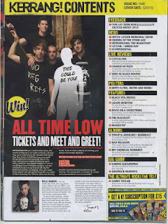
Contents page analysis 5

The general house style of this magazine is followed in all kerrange magazine, with there being a bold heading, a colour scheme that runs through the font cover, lots of images and a wide range of fonts and text. In this particular karrange! magazine, I think that the amount of content is appealing as it is quite messy, possibly portraying the rock genre more than the indie genre. 
The style of the contents page I find very interesting as I really like the layout, how there are a fairly equal amount of text to image. Although there is only 1 dominant image used, I really like this feature as I think it makes the magazine look exciting and makes me want to read on, knowing that the article is going to be interesting is it takes up the full contents page.

There are 4 main colours used in this page (yellow, red, white and black) personally, I think that having 2 bright colour is too much, as it doesn't allow the audience to focus on the text or the image as they are distracted by the multiple colours surrounding them. The font in this magazine is a very sharp, bold & clear font and therefor I am going to use the convention of having a bold font in my contents page. 

At the bottom of the content page, there is a editor note, in which a positive relationship with the readers is formed. I believe that this feature is not necessary but adds a profession touch to the magazine, which is why I will consider doing this.

Wednesday 15 February 2017

Contents page analysis 4

 This contents is form the magazine Q

The page numbers and tile are all down the left side of the page, with each article having a bold title in capitals, with a brief overview of what the story's contain in non capitals. There is a date and issue number at the top of the page, in which shows the audience when they bought the magazine and how many copy's of the magazine have been issued.
There is a title at the top saying 'contents' which isn't a big as some of the title on contents pages I have analysed. I believe that this side of a title is appropriate, as I dont believe that it is the most important feature of a magazine.
The image is one of the most striking convention of this particular magazine, as it shows a low angle photograph of a band where by the male artists are all making eye contact with the camera and are pulling serious facial expressions. the image engages with and gives the reader a insight as to what the article is going to be about, as well as the introductory quote used on the left side of the photograph.

There is a every month section at the bottom of this contents page, in which features articles that appeal every month for example Q top 50 gigs. This gives the magazine its own identity and  uniqueness.

Overall, this contents page looks very professional and I believe that the amount of content is excellent and looks very clean. The amount of image shown I believe to be not too many, so therefor would probably use more image in my contents page.

Tuesday 14 February 2017

Contents page analysis 3

The masthead of the content page is written in a solid black colour, which I believe is very effective as it is bold and therefor easy to read. The date and issue number, along with the text, doesn't obstruct the image on the content page. As there is only 1 image on this content page, it is important to understand that it cannot be mask by writing otherwise it would look too plain. The cover story is easily found on this contents page, as it is segregated form all the other text and is therefor easily identified and more predominant within the page. 
The other page uses the convention of having the page number in the tri colour scheme therefor I am going to use this convention, as the contents pages I have analysed so far use this feature.

The contents page also adds a quote at the bottom of the text from one of the articles. The quote has mystery to it making the audience want to read on more and know what the artist is talking about. I really like this feature of having a quote at the bottom of the page as I believe it will attract the audience a lot more, as they will want to know what the quote is about. 

A date and issue number has been added between 2 red dotted lines above all of the text and the main part of the image. This is a classic code and convention of any continents pages as it divided this information from the article and also it doesn't look to busy and messy 

The mise-en-scene for the male artist in this image is highly unusual for a music magazine, as the man is lacking clothing which usually isn't seen on a content page, however, it does portray his reckless not caring attitude, which can be shown by indie artist. Although I am not going to have my model wearing a lack of clothing, I am going to make them have attitude on the photo I take as I want to portray the indie genre as much as I can.

Monday 13 February 2017

Contents page analysis 2

Layout
I really like the minimalist look of the contents page, as it shows a male soloist on one side on the cover and then writing on the right side of the page. It is a features of the magazine, therefor only shows the most important features of the magazine. The features category has a heading and a sub heading, in which explains what the article is about. The contents page layout is a typical layout for a magazine of this indie genre as it uses the same fonts as their front covers and constantly uses the same font throughout the contents page. I like how the main article is stood our form the test and red lines have been used to separate this article. I am therefor going to make my main article stand out compared to the rest and ensure that I have lines in my front cover, as I believe this will add  professional quality to my magazine.

Colour scheme
The colour scheme from the front cover is carried through to the contents page (thus being res, white and black. This colour scheme is very effective s all the colours contrast each other, making whatever is written stand out. By using the colour scheme, it creates a unique identity to the magazine and makes the magazine create its own brand identity. 
I am therefor going to carry my colour scheme thought into my contents page and highlight important features in the colour of my scheme, I am also going to highlight the page numbers in my colour of choice, as this is what this existing magazine has done.

Font/text/sub text
For the contents page, the magazine ensures that the main article are wrote in capitals, and the sub text in lower case. They have added a quote to the bottom from the artists on the photo and have the more important information in a bigger font & bright colour, so that the audience find it easy to read. There is also the date and issue number at the top of the contents page, in which are written between 2 lines. I really like the convention of having the most important information in a bigger font, and also like the idea of having  a quote on a double page spread

Overall, I really like the layout of the Mojo contents page as I believe it have a very professional finish form the minimal use of photographs and the lack of content. I am going to try to recreate this look in my rough cut, and then experiment more with it when it comes to my final cit. I like the feature of having the magazine name at the top of the magazine, therefor will most likely add this convention in and ensure that is is bold and stands out.

Sunday 12 February 2017

Contents page analysis 1


nme front contents page012Colour                                                             There is a predominantly colour scheme of red, white and black. This tri colour scheme is usually found in magazine, especially NME as this is the house style scheme they follow. The colour scheme is kept consistent through out the magazine, with the front cover, contents page and double page spread all counting the colour red. I have decided to use the convention of only using my house style colours in the making of my contents page as it adds a professional style to the magazine and shows a strong coloration between the pages. I am therefor going to keep house style running through out my pages.
Layout
This contents page is very typical of NME as they tend to stick to the same theme of their contents by having images in the middle, text on the right and some sort of information under the image. The name of the magazine is at the top of the contents page, in a large font,  it stands out and come across as being a very important feature of the magazine. This magazines uses lines to separate their sections of the contents page and uses their colour scheme of black, white and red to highlight these lines. I have decided that I am going to use the layout on this contents page as inspiration for when I create my contents page as I like how busy it looks full of storeys. I am also going to incorporate the idea of having line coming down my contents pages as I believe this adds a professional quality to my contents page.

Image
This consent page has used 1 image, to show importance of the article. The image is showing 2 male band members, persuasively playing at a gig. The image is highlighted as one of the key features of the magazine as it is central inside on the contents and is the biggest aspect on the consent page, therefor drawn in the audience, making them want to read on. I like how the image is so big and draws the audience attention in, therefor might consider this when making my magazine.

There is also a subscription box a the bottom of this magazine, in which the audience signs up and gets to save money on their next issue. I really like this convention and therefor am going to use it in my magazine as I feel like it makes the magazine look like a existing one as it is a quality that lots of magazines use.


Saturday 11 February 2017

Front cover analysis 5

NME front cover

For the final front cover I am going to deconstruct, I have decided to look at NME again as I believe that this magazine is my biggest interpenetration and uses lots of codes and conventions that I find effective and professional.

Image
The image on this front cover shows a duo act, in which 1 male has their arm around the other male artist. The image is taken with a white background, where by the image is placed on top of this plain background. The artists on the front cover are wearing relaxed indie style everyday clothing such as a shirt and a t-shirt with a distinct piece of writing on. The image is central to the page and therefor is one of the most eye catching aspects of this front cover. There is a Indie undertone in the pose the model is pulling, as they look quite serious, but at the same time look almost angry.
From the analysis from the image, I have decided to use the convention of having my artist wearing causal clothing, with a t shirt with some sort of distinctive writing on to give it edge. I am also going to take my photograph on a plain background, ideally white, however this may change once I have a idea of what will go where on my front cover, as the font colour I use may not balance the image out with a plain white  background.

Masthead
the masthead on the magazine is the same as the other NME magazines I have analysed. This masthead is behind the mage, however I have already commented about this feature in on of my previous analysis, discussing the pros and cons of having the image in font of the title.
From this masthead analysed, I have decided that I am going to put my image behind my mast head, but at the same time, make my  masthead bold and clear.

Colour scheme
This magazines has all their key features in red, therefor it is easy for the audience to understand important features in the magazine. The bright colour scheme balances out the image well, as not only is it used to colour text, but coloured boxes/strips of colour have been used as a background for text. For example, in the bottom left corner, there is text wrote with a red box behind it. I think that this use of the colour scheme is effective as is balances the colours on the image and makes the magazine look more exciting, therefor I am going to use this feature of the colour scheme.

Text/ Sub text
The sub text in this magazine is written under the main article in capitals. The sub text lies on either the left side of the page or the right side of the page and is never used without a heading above it. There is an appropriate amount of sub text on this front cover, as there is 6 article stared on the front cover, in which will probably be the main most important articles in the magazine. I am going to use the convention of only using a suitable amount of sub text in my magazine, as  want it to look professional and clean. I am also going to take on board that this magazine only places the text on the left or right side of the page and leaves the middle for the photograph. I am going to add my artists name in a larger font at the bottom of my magazine, so that there is a clear indication of who the article indie the magazine is on.

Friday 10 February 2017

Front cover analysis 4

Image
Although this is a different genre magazine, it looks very similar to the front cover of NME that I have just previously analysed. The image on this front cover shows a black and white close up of a male soloist, where by his image is in front of the masthead. The male artist is wearing quite  a basic bit of clothing and isn't giving eye contract to the camera. the model is looking away from the camera and is pulling a slightly confused facial expression. In my magazine, I have decided to use the contention of having a soloist o my front cover. However, I am not going to carry forwards the feature of having the artist not making eye contact with the audience, because it gives a more mysterious  feel to the magazine, which isn't the feel I am gong for. i am going to carry forwards the closeness of the photo as i feel like this looks effective.


Mast head
The masthead on this is 1 plain simple letter, with a red box behind, which also links in with the colour scheme of red. I have notices so far that lots of magazine use the colour scheme red, therefor will consider this factor if my audience choose to use the colour red as I dont want my magazine being masked by already existing establish magazine such as NME and Q. The masthead on the image is behind the photo of the artist, however I dont think this quality as I believe that the masthead is one of the most important features of a magazines this is what gives the audience the identity of the magazine. The masthead is on the left side of the magazine. Therefor, I have decided to use a basic name for my magazine, ensure that the title is bold and easily readable. 

Colour scheme
The colour scheme in this magazine is red, white and black. The important features such as the name for the artist that double spread is going to be on is written in red. I really like the convention of having a tri colour scheme and having important text written in the red colour. I also like how the scheme of red is bright and colourful & I think that this makes the articles and magazine standout. I will use the code and convention is having a tri colour scheme, making sure important text is written in my colour scheme and ensure that the colour I do decide to use is bright and bold.

Fonts
This magazines uses a similar range of fonts and uses clear and easy to red fonts. The font has a blocky sharp look to it, which makes the font easy to read and very clear. This magazine used a range of at least 2 different fonts which I really like. I have decided that I am going ti use 2 different fonts for my text and masthead, as I want there to be a clear difference between these 2 conventions of a magazine. I am going to ensure the the fonts \I do use have a blocky sharp look to them and that they are understandable. 


Thursday 9 February 2017

Front cover analysis 3


NME front cover

Image
This magazine used a close up shot of a model wearing sun glasses looking off into the distance. The image takes up the majority of the page and is in black and white. The male soloist is wearing dark clothing and isn't pulling any facial expression and has quite  blank look on his face. I really like how this model is wearing sun glasses, therefor will experiment what this idea and possibly get my model to wear sun glasses in my photo. Although a lot of magazine dont use model's wearing sun glasses, I personally think that this image is very effective and gives the soloist a look is being 'cool.' I also really like how the photo dominated the front cover, and goes behind the masthead.

Mast head
The mast head is written in the red colour scheme used and is bold and dominant. It contrasted again the black and white background, therefor stands out. The masthead sits in front of the image, which is a feature I really like in a magazine, as it makes the mast head stand out, therefor gives the magazine its own identity, and isn't masked by a image.

Colour scheme
Again, this magazine used a tri colour scheme, where there are 3 district colours, which all contrast each other making it bold and stand out. The most important text is coloured in red as well, resulting in the word 'Liam' standing out as not only is the written in a very large clear bold font, but is also coloured by the red colour scheme. I really like the feature of the most important text being coloured in red, as it is easily indicated to the TA what is important and by glance is easily understood and readable.

Text
In this magazine front cover, the text is written across the whole page in a large bold font. Under the work 'Liam' there is a small descriptive piece of information telling the audience what the article is about. The sub text under this says 'answers your questions' and the 'your' part is written in red. I really like the feature of text where the main article stands out due to it being so large and coloured in red. I also really like how the sub article information directs the audience personally by saying that 'Liam' will answer questions from the audience. I really like these features therefor will use them on my front cover.

Fonts
This magazine uses a very plain basic, simple, easy to read font and is very bold and sharp throughout. All the text on the front cover is in capitals making it easier for the audience to read and stands out more than regular lower case letters. I really like the feature of only using capitals on the front cover, and how the font is a very sharp bold font as it is clear and easy to read.

Wednesday 8 February 2017

Front cover analysis 2

NME FRONT PAGENME FRONT COVER

Image
On this NME front cover, the artists is holding a instrument, and is it s a mid shot of a male soloist. The soloist is wearing relaxed clothing (plain black top and denim jacket) and is facing downwards but insnt in the centre of the page. The front cover image using a plain white background, in wihc test is place over the top so it doenst look plain. 
From this front cover analysis, I have decided to dress my model is relaxed clothing such as a denim jacket with a black t-shirt as this gives a relaxed look, which is the look I am going for. The image dominates that page, therefor I am going to use this convention in my front cover. I am also going to use the convention of using a soloist for my front cover and use a light background. 

Mast head
On this magazine, the masthead is written in the colour orange, which is the third colour in the colour scheme of black, white and orange. The title is written in a bog and bold font and can easily been seen by the TA. I am going to use the convention of having a big and bold title so the audience can see it and add me own touch on it (not necessarily by chaining the colour of it like this magazine has done) but possibly add its own distinct unique feature such as a line through it. 

Colour scheme
This magazine uses the colour scheme of black, white and orange and highlights important information in orange. I really like the colour orange on this magazine as I believe it makes it unique and stands out. The colour is gender neutral, therefor contacts a mass audience, in which I would also like my magazine to do. Because of this factor, I have decided that I am going to consider using the colour orange when making my magazine as I believe it is a very effecting bright bold colour, which would give magazine its own uniqueness as it is a very contrasting colour. I am however going to leave the colour for my audience to decide, but will also take into account how effective the colour orange looks.

Text
Again, this magazine uses main article text and sub text. The sub text is written in black and white, and some text is written in bars along the right hand side. The bars are in the orange colour and the text is written in white. I really like this feature of the text being inside of a bar, therefor will try to bring this into my magazine. I will also ensure that I have main articles and sub articles on my double page spread, and try to write in in the fashion this magazine has, by using their layout.

General conventions.
This magazine has a banner at the top of their front cover, in which shows the audience what they could get inside of the magazine (free posters.) the magazine also has a a bar code, running house style of 3 dominant colours, a date, and a central image. Therefor, because of this research I have decided that I am gong to take on board the convention of having a banner at the top of my magazine as I believe this is very effective and therefor adds a professional touch to the magazine.


Tuesday 7 February 2017

Front cover analysis 1

In today's lesson, I looked closer at front covers and started my analysis process in which I will analyse 5 front covers, 5 contents pages and 5 double page spreads from established music magazines, fitting my genre 'Indie.' 
During the analysis of front covers, I will disuses the photo style, the conventions, colour scheme, fonts, layout and the text used. I will then go on to disuses how I will use this information when creating my own front cover.

I have looked at magazines such as NME, Q and Mojo.


Here, I will begin the analysis of the front cover from an NME magazine.


1. NME

Masthead
The mast head on this magazine is bold and bright, catching the audiences eye and standing out against the contrasting background. The mast head is large and very bold meaning the audience can acknowledge that this is the magazines name and not any other form of text on the front cover. The masthead is 3 simple letters, in which conveys simplicity. The simplistic masthead makes it memorable for the audience and easy to identify, as people don't tend to spend long looking at front covers. The masthead is located in the left corner of the magazine.
From this analysis, I have decided to use the convention of making the masthead bold, and possibly turn the font into a different colour, matching my colour scheme I am going to decide on. I am also going to use the convention of having a shot simple name for my magazine, consisting of between 3-6 letters, and then ask my TA what name they like best.

Image
In this front cover, the image is a mid shot of a solo artist pulling a shocked/confused facial expression. The image goes in front of the name of the masthead. The artist is holding a record disk, linking in with the genre by this prop used. the artist is wearing a black relaxed shirt with the top button undone, giving him a more relaxed look. There is only 1 photo on the front cover- this being the mid shot of the male soloist. The image in is the centre of the page, with the rule of thirds being used into practice here, as he is in centre line with the page.
The male is pulling an unusual facial expression, with his head tilted to one side.
From this analysis, I have decided that I am going to use the convention of only using 1 image on my front cover, and use a soloist, with the soloist being in the centre of the image, as this is a popular convention in a music magazine. I am also going to get my model to wear 'relaxed' clothing, rather than something too smart. I am going to ensure that my photo is taken within the rule of thirds, so that the model is in the centre of the photograph. However, I don't think that I am going to put the image in front of the name of the magazine, because I feel it is important to keep the magazines identity and not mask the masthead with a image, because after all, the masthead is what makes a magazine unique.

Colour scheme
This magazine used the colour scheme of black, white and red. This is a tri colour scheme, which is a popular convention I have noticed when doing my initial research. The main colour scheme is having monochrome, then 1-2 dominant colour, in this case this colour is red. The important information such as the magazines name and the artists name is highlighted in this bold colour, the the colour is carried through onto the other pages of the magazine. I have decided that I am going to use this feature of using a tri colour scheme in my magazine, as it is a highly used convention of a magazine and therefor would give it a professional finish. I am going to use monochrome then 1 dominant colour, which I will get my target audience to decide when I do my questionnaire, I am also going to ensure that the most important information on my front cover is highlighted in the main colour I am going to choose. From looking at this magazines contents page and double age spread, I am going to ensure that a house style of colour is carried through to all my pages, as this is what my magazine has done. 

Text
Again as previously mentioned, I am going to ensure that the most important text is highlighted in the dominant colour i am going to decide to use. the text on this front cover is all in capital and is all in a clear bold font. The article information on the front cover has the heading information for the article, with some subtext underneath suggesting to the audience what the article is about. The majority of the story's on the front mentions artists name, which will attract the TA to buy the magazine, because if they see an artists name that they like, they will want to know what the magazine article is about. The text on the front cover also has a 'plus' section, suggesting to the audience that there is more story's than just the ones on the front cover.
From this research, I have decided that I am going to add lots of different artist names to my front cover, as this is a popular magazine convention and therefor has an appeal to the TA. I am going to write all of my text in capitals as it is bold, eye catching and clear to read. I am also going to add my text in the relevant places that this magazine has, for example, add a list of artists down either the left or right side of the page. I am going to write the main article either right in the middle of the page, or make it large towards the bottom of the page. 

General conventions
This magazine has the general contentions of a bar code, a website link, a masthead, a image, text and subtext, price and main article story being large at the bottom.
From my observation of their front cover, I am going to add these features to my magazine as they will give it a professional quality. 

Monday 6 February 2017

Check list for a music magazine

During lesson time, we discussed what made a successful music magazine, highlighting key features of what a front cover, contents and double page spread needs to contain in order to be successful. I came up with a check list from reading and reviewing hard copy's of music magazines such as Kerrang, Mojo and NME. 

Here is a criteria I have come up with
Displaying IMG_6775.JPG
To ensure that I have a deeper understanding of the codes and conventions of music magazines, I am going to analyse 5 front covers, 5 contents pages and 5 double page spreads and discuss why specific features have been used and say weather is is going to help me when making my magazine.

Sunday 5 February 2017

Audience research

Today in lesson, we did some audience research and made a mind map showing different ways that we can do some further in depth research into our target audiences. 

Here is a mind map of my ideas

Saturday 4 February 2017

Rock/ heavy metal magazine analysis

Displaying IMG_6575.JPGToday in class, I analysed the front cover of the popular rock magazine 'kerrang!' and looked the the coed and conventions in which makes this magazine successful and clearly portrays the rock genre. I have picked out key features of what makes a rock magazine 'rock' style. I picked out how the colour portrays rock, how the facial expressions of the singers also portray's the rock genre and how the text its self is targeting its specific audience.  

Although this is not the genre I am going to be doing, it did give me a insight of what makes a rock magazine 'rock.' I will therefor not go for some of the features i picked out, as I don't want my magazine to be under the impression of being in the genre rock. 

Friday 3 February 2017

Initial ideas for my music magzine

After handing in my mock school magazine, the real work has now started..

During today's media lesson, I have created a mind map of initial ideas for my own music magazine. After debating genres, I have finally decided that the genre of my magazine is going to be Indie as I find this the most interesting music genre and I personally enjoy that style of music.

I have accumulated a list of conventions that a front page, contents page and double page spread must contain in order to be successful. 
I have also created a list of music magazines in which I can analyse later on as well as thinking of some research methods which I can conduct. 

Here is a mind map of initial ideas
Displaying IMG_6790.JPG

Thursday 2 February 2017

DEADLINE DAY! Final contents page for my school magazine

Here is my finished Contents page for my magazine. I decided to use the school logo for my background as it keeps a house style running through out my pages as I also used the logo on my front cover.
 I have applied the correct codes and conventions to my pages, for example, I have put on page numbers, a heading for each page and sub text under the heading telling you about what is inside each page.
I have also added a title to the top, the school logo and photos along the side to show what is in each article. 

Wednesday 1 February 2017

DEADLINE DAY! Final front cover for my school magazine


This is my front cover for my school magazine. I have again applied the codes and conventions of a magazine.
 I ensured that the pupil on my front cover was wearing the correct school uniform for the school, was smiling and was in the centre of the photograph (which was a mid shot.)
This enabled me to add text around the sides, where there was room. 
I have kept the fonts on the front page consistent and clear.
 I have added conventions to my magazine such as the date, headings & sub headings, a masthead and the school logo behind the title to ensure I keep a house style theme running through out.