For the final front cover I am going to deconstruct, I have decided to look at NME again as I believe that this magazine is my biggest interpenetration and uses lots of codes and conventions that I find effective and professional.
Image
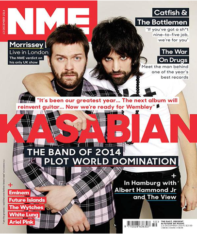
The image on this front cover shows a duo act, in which 1 male has their arm around the other male artist. The image is taken with a white background, where by the image is placed on top of this plain background. The artists on the front cover are wearing relaxed indie style everyday clothing such as a shirt and a t-shirt with a distinct piece of writing on. The image is central to the page and therefor is one of the most eye catching aspects of this front cover. There is a Indie undertone in the pose the model is pulling, as they look quite serious, but at the same time look almost angry.
From the analysis from the image, I have decided to use the convention of having my artist wearing causal clothing, with a t shirt with some sort of distinctive writing on to give it edge. I am also going to take my photograph on a plain background, ideally white, however this may change once I have a idea of what will go where on my front cover, as the font colour I use may not balance the image out with a plain white background.
Masthead
the masthead on the magazine is the same as the other NME magazines I have analysed. This masthead is behind the mage, however I have already commented about this feature in on of my previous analysis, discussing the pros and cons of having the image in font of the title.
From this masthead analysed, I have decided that I am going to put my image behind my mast head, but at the same time, make my masthead bold and clear.
Colour scheme
This magazines has all their key features in red, therefor it is easy for the audience to understand important features in the magazine. The bright colour scheme balances out the image well, as not only is it used to colour text, but coloured boxes/strips of colour have been used as a background for text. For example, in the bottom left corner, there is text wrote with a red box behind it. I think that this use of the colour scheme is effective as is balances the colours on the image and makes the magazine look more exciting, therefor I am going to use this feature of the colour scheme.
Text/ Sub text
The sub text in this magazine is written under the main article in capitals. The sub text lies on either the left side of the page or the right side of the page and is never used without a heading above it. There is an appropriate amount of sub text on this front cover, as there is 6 article stared on the front cover, in which will probably be the main most important articles in the magazine. I am going to use the convention of only using a suitable amount of sub text in my magazine, as want it to look professional and clean. I am also going to take on board that this magazine only places the text on the left or right side of the page and leaves the middle for the photograph. I am going to add my artists name in a larger font at the bottom of my magazine, so that there is a clear indication of who the article indie the magazine is on.
No comments:
Post a Comment